X is as X does.
Elon Musk.
I would imagine that just reading his name evokes emotions in some. As a controversial figure, most conversations about him lately devolve into politics – my least favorite subject.
Given that Mr. Musk is sitting on several billion more dollars than I am, it only seems fair to adopt a "wait-and-see" approach to some of his most recent decisions at Twitter, or X, or whatever.
That being said, he has recently veered into my lane with his "X" rebrand shenanigans. Therefore, he is fair game. And I'm way overdue for a blog entry. So allow me to weigh in and offer some 'inxights.'
First, a brief history:
To be fair, the evolution of Twitter's brand has taken many turns over the years. The signature blue was once a soapy green (think Irish Spring, or maybe Comet). Originally, there was no bird at all. The company's logo used between 2005 and 2006 was a bubbly, compressed logotype (complete with actual water droplets). A surprising fact that mimics recent events is that it was designed by one of the co-founders, Biz Stone. His ideation even included an alternate name, "Smssy," at one point. I guess that's a play on "sassy," or "schmooze?" "Schmassy?" Not really sure. All things considered, it was a relatively obscure exercise, and never really seen by the masses.
The original Twitter logo, designed by co-founder Biz Stone, circa 2005.
A more public facing iteration of the Twitter logo was introduced in 2006, designed by Linda Gavin. The now familiar light blue made its first appearance, and the design could be described as an evolution of the original 'bubble' lettering. However, the letterforms took on a more horizontal aspect ratio, with a smooth, rounded sans serif design.
A new logo design by Linda Gavin, ready for its close-up in 2006.
This logotype was intended to stand alone, but the company ultimately complimented it with spot allocations of a stock bird symbol illustration bought from iStock for a whopping $15. (Perhaps Mr. Musk is not alone in his eligibility for derision – from brand snobs like myself). The bird was affectionately nicknamed "Larry," as a tribute to the Boston Celtics basketball legend, Larry Bird.
Between 2010 and 2012, the logo evolved again. Once more, co-founder Biz Stone played designer by crafting a personalized version of the original $15 bird. To his credit, he then passed it to designers Philip Pascuzzo and Douglas Bowman to further refine the mark. This was added to a simplified version of the bubble type created by Gavin.
An updated version of the logo, paired with “Larry” the bird in 2010.
By 2012, the Twitter bird had achieved enough brand recognition and town square equity to gain parity with cultural icons like the Nike swoosh. Company management chose to fine tune the mark, adjusting the original light blue to a slightly darker tone (Hex #1da1f2) and enlisting designer Martin Grasser – fresh out of college – to refine the illustration.
A refinement of the Pascuzzo/Bowman bird, designed by Matt Grasser in 2012.
After slogging through at least a thousand iterations (Whew! - he's a regular Aaron Draplin!), Grasser presented Jack Dorsey with 24 finalists. Mr. Dorsey chose "Option 5CS" without hesitation. The man knows his birds. The final design was the mark we all know and love – knew and loved until a month ago. It was deceptively simple, actually formed from some 15 intersecting circles assembled in layers to create the perfect head, wings, chest, and tail. It directed it's attention upward in a gesture of hope and freedom. Mr. Grasser's design was solid.

Grasser’s bird, with the curtain pulled back.
And then . . .
X marks the spot where everything changed, as everyone knows. Following suit on his curious obsession with the twenty-fourth letter, Elon Musk announced the need for a new design on June 23 by soliciting concepts on his newly purchased platform – in the ultimate act of brand crowdsourcing. "Crowdsourcing" is one of my least favorite words.
He suggested that he would favor designs with an Art Deco flair. Not sure how that plays into a brand strategy. The winning submission was reputed to be from a gentleman named Sawyer Merritt, the founder of an apparel brand called Twin Birch. Mr. Merritt was actually forwarding a design by Alex Tourville, who created the mark to brand a podcast called The X Show . . . about Elon Musk.

A quaint exchange between the collaborators.
The common consensus on Mr. Tourville's design, by way of Mr. Merritt's suggestion, is that it mimics a glyph from the "Special Alphabets," specifically Unicode Mathematical Double-Struck Capital X.
Martin Grasser, the designer of the predecessor, mourned the bird's passing. His thoughts are captured in this quick interview with the BBC.
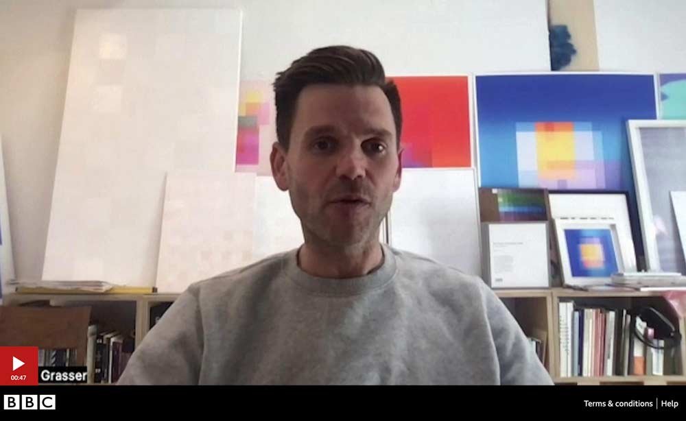
Mr. Grasser opines on the demise of his bird.
With respect to design, it could not be more of a departure from its volucrine predecessor. While the Twitter bird was carefully composed of interlocking circles, Brand X is all lines - slicing through the frame with abrupt abandon. And of course, the familiar blue is surrendered in favor of an arbitrary black.
X-ophobia? X-ophilia?
So what do we make of this new X factor? I love an insightful quote contributed by Neil Cooper, head of design at Wolff Olins London. He said,
"An instantly recognizable color palette, a globally known logo, and brand verbs such as ‘tweeting’ have worked their way into the zeitgeist of popular culture. All were destroyed overnight. This may or may not be the worst rebrand of the last few years, but it will certainly be a case study for design students for many years to come."
What an elegant, British way to put it.
Another, less polite contribution came from James Kirkham, chief executive at Iconic:
"This logo feels like one created in the first year of my graphic design degree. The tone is pure comic book, like an early 90's version of Marvel mutants before the universe had its necessary glow-up. It will be ironic if this ends up being more of a deterrent to users than the platform’s perceived social toxicity.”
Even more blunt, Professor of Marketing Scott Galloway at NYU savaged Musk for "incinerating 17 years of brand equity within 10 months."
I suppose one of the reasons I personally find this rebrand so offensive stems from its sheer thoughtlessness. Or, the appearance of thoughtlessness. The whole episode counters what seems accepted wisdom in brand strategy – that is, carefully listening to and studying your target audience and then tailoring your brand accordingly. I'm struck by the willful destruction of long-building recognition and brand equity; the abandonment of that elusive cultural achievement of your brand becoming part of the common lexicon, like "escalator," "band-aid," or "crock pot."
Was it thoughtless? Elon Musk's own rationale was simply stated:
"The Twitter name made sense when it was just 140 character messages going back and forth – like birds tweeting – but now you can post almost anything, including several hours of video. In the months to come, we will add comprehensive communications and the ability to conduct your entire financial world. The Twitter name does not make sense in that context, so we must bid adieu to the bird."
The Musk vision aims to expand what was once Twitter to become a "super app," modeled after examples like India's PayTM, Indonesia's GoJek, and China's WeChat. In the latter case, the app sports some 1.29 billion users in mainland China alone. These "everthing" apps enable users to shop or pay for services - a sort of mashup of Amazon and current Twitter, among other things. These are all laudable, if elusive, goals.
It's certainly rational to consider an evolution of a brand to suit a shifting landscape or vision. However, the key word is "evolution," not the radical transformation that heralded "X." Commentator Justin Urquhart Stewart has pointed out that it risks alienating Twitter's "loyal but aging base." He adds that "the younger generations have moved onto other apps and Twitter does look a bit old-fashioned. Elon Musk has got to be careful as you are almost starting from scratch with an older audience, meanwhile damaging the original brand." In other words, respect your audience.
Some have postulated that the abruptness of the rebranding was designed to take advantage of Facebook competitor Threads faltering out of the gate. And to be fair, the debate about this continues to rage on . . . wait for it . . . Twitter. I mean, X. The flaw in Musk's logic might be a feature. But I'm dubious.
An X by any other name . . .
Regarding the design . . . it's just BORING. Even if one were to accept the premise that embracing the "X" moniker is logical, there are so many delightful directions that could have been explored. A quick search on Pinterest triggers an avalanche of memorable possibilities.
Brand design, as part of a larger brand strategy, relies so much on gaining a deep understanding of who your customer is and what she wants. A proper brand tailors itself carefully to not only tune into its own mission and purpose, but also the challenges and longings of the people with whom it hopes to connect. All this requires careful thought and cultivation.
However, the Musk approach rips all this away. It's as if he's reduced the alchemies of branding and logo design to something akin to the thoughtless tweets (xeets?) so often present on his platform – impulsive, hyper-personal, and reckless.
To take another tack, you could label all this a form of self expression (with Olympic proportions). Few people are in a position to 'express' their own personal proclivity on such a scale. That's not necessarily bad by definition. I don't believe billionaires are inherently evil. They're flawed humans, just like the rest of us. Mr. Musk actually owns this monster fair and square - bought and paid for with his own money, not long after paying the largest tax bill in history.
Following this line of thought contrasts an episode a few years ago with Yahoo's CEO, Marissa Mayer, which was arguably worse. Actually, it was a decade ago. Unlike The Musk-ovite sole proprietor, she represented shareholders aplenty, and yet deigned to make that company's rebrand a personal weekend project.
So, the argument would be: it's his. Let Musk do what he wants with it, even if it means driving it into the ground. But, my goodness. The level of risk inherent in this flippant self expression, this gut level hunch, is enormous.
I've rambled too long. Let's conclude this rant by simply saying that Elon Musk's X-ification of Twitter certainly seems like an epic branding . . . misfire? Catastrophe? Fiasco? Choose the most colorful synonym you like. More than anything, it's because the Muskological approach violates the critical role of listening that's so essential when approaching a design conundrum as complex as a rebrand. I'm sorry – soliciting a pseudo-poll on Twitter/Xitter/X for a new logo is NOT listening. It's more akin to pulling the lever of a slot machine. Best of luck, Mr. Musk.